
Every wave in a swell breaks differently. Waves within one swell range in size and period, so when we say, “six foot at 13 seconds,” we mean that the average height of the largest third of waves is six foot, and the most energetic waves are around 13 seconds apart.
You might be used to reading the Surfline swell graphs to understand where wave energy is concentrated, but we all know from experience that two days (or even two hours) with six foot at 13 second swells can result in a different experience in the water.
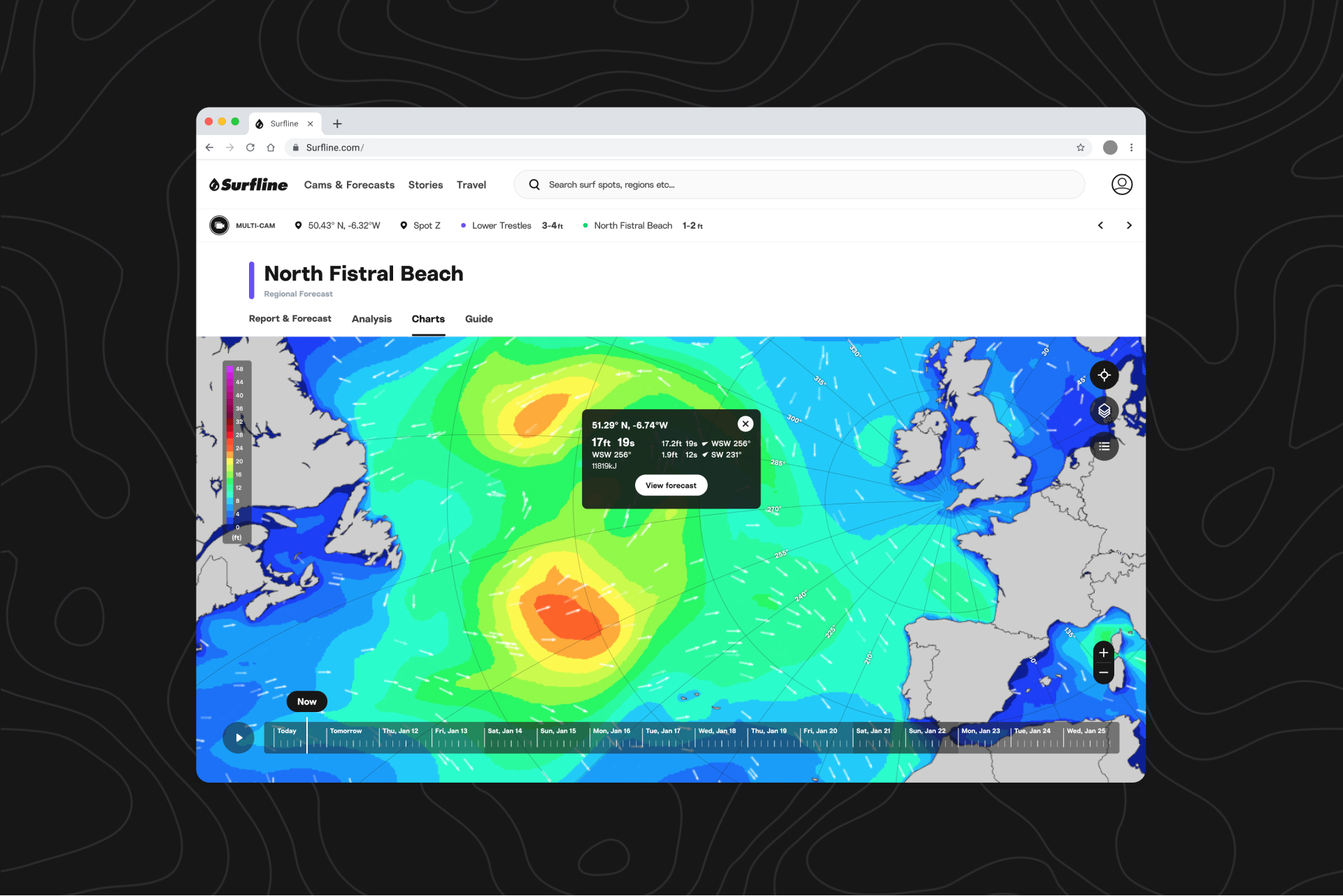
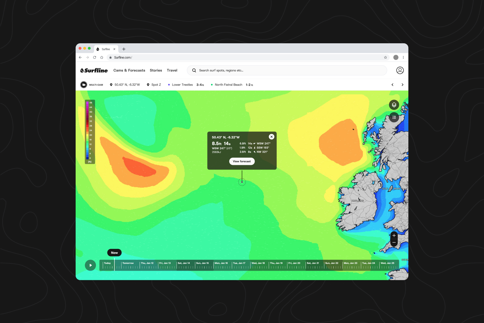
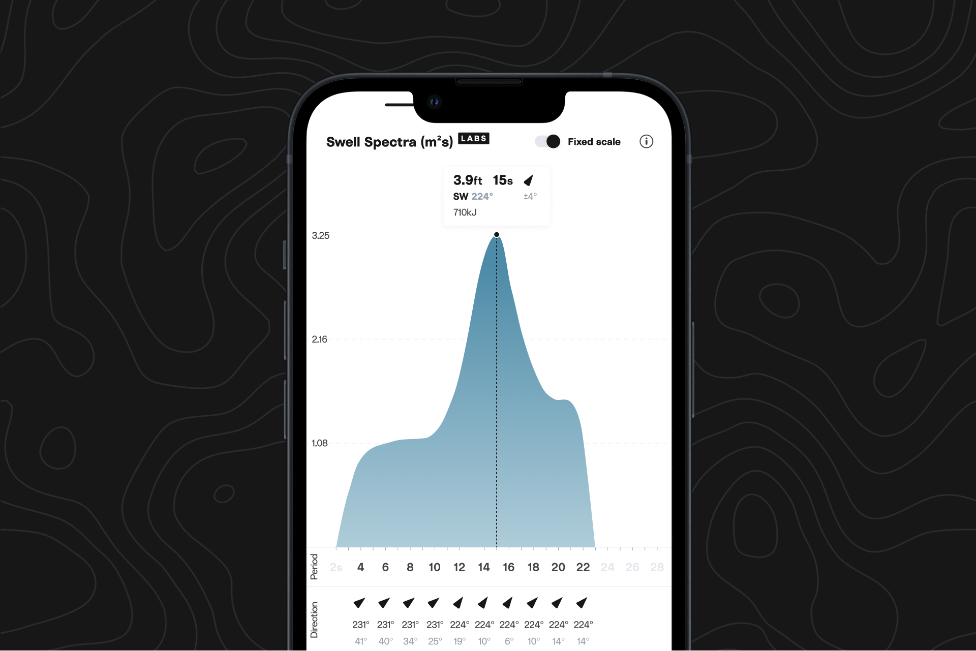
Swell spectra shows you not just the averages (the peaks on the spectra graph), but where all the energy is distributed in a swell. For MSW fans, this graph should look and feel familiar.
Where can I find it?
Find swell spectra under Advanced Swell below the surf graph on iOS and at the bottom of every spot page under swell spectra on web. Available now to Premium and Forecast members.
You can also view buoy swell spectra, featuring real-time data, when you visit the explore tab, scroll down, and toggle to buoys. You can also scroll to the bottom of a spot page and click on your local buoy (all platforms). You’ll find the spectra graph below the latest readings and reported data graph. Learn more about buoy swell spectra here.
How to use swell spectra to understand surf conditions.
Concentrated spectrum
In this example, nearly all of the energy is concentrated across a small number of wave periods, so this is a very concentrated spectrum. Concentrated energy is usually associated with less consistent swell (i.e. longer breaks between sets of waves), so you can expect there to be more waves in a set, and for the waves to be more organized and uniform in terms of shape and size.
Wider spectrum
Above, the energy is distributed across many wave periods, creating a wider spectrum. The peak of the spectrum is still ‘sharp’, so you’ll observe a good amount swell associated with the 15-second wave period. But overall, the wider distribution means both shorter period and longer period waves will be in the mix, leading to conditions that will likely be a little bit mixed up and disorganized, but consistent. This is a great example how the ‘peak’ we list elsewhere may not always give the whole picture.
Missing swells
Sometimes, the LOTUS model has difficulty identifying the separate swells in the wave spectrum. With this example, LOTUS has only identified and listed one swell, because there aren’t clear individual peaks. The spectrum provides the full picture, which shows significant energy in other periods, which will likely create mixed up and choppy surf.
In this situation, a small change in the energy at ten seconds could cause the ‘peak’ to jump down from 15 seconds. You see this happen quite a lot in the forecast, and the swell spectra can help explain that the surf doesn’t necessarily change as much as expected in that scenario.
Graph key
- Spectral wave density*: y-axis
- Wave periods: x-axis
- Mean wave direction at each period: arrow and degrees in black
- Mean spread of direction: degrees in gray
- Partition wave height: see tooltips at peaks
*Spectral wave density represents the distribution of wave energy across the different periods.
Why did we build this?
Swell spectra is part of our effort to give you everything you need to get involved with the forecasting process, so you can dig a little deeper and know exactly how swells will be affecting the spots you want to surf. Many Surfline members want deeper access to the data behind our surf height predictions so they can make their own determinations about surf conditions at that spot—or nearby secret spots.
Everything else you need to know.
As a Surfline Labs feature, swell spectra is still in its early phases, and the UI and data models behind it may continue to evolve as we test it out and receive feedback from members. Feel free to reach out with your thoughts at feedback@surfline.com.
What is Labs?
Surfline Labs gives you a window into the development of the latest features we’re bringing to Surfline, and the opportunity to help them reach their full potential. It’s like stepping into a shaping bay, giving the shaper feedback as a new surfboard model comes to life, testing it out, and making notes so the shaper can try a new iteration, until you get the final result—a perfect board.
Labs features are experimental and the data models behind them are works in progress, so set your expectations accordingly. They will often be available for a limited time, and we may polish and ship them, or decide they don’t make the cut and remove them. Some features will be available to all, and others will only available to subscribers.